
Taking the Plunge to Re-brand.
Making the decision to change the company name and re-branding the practice was not a decision taken lightly and was made with a certain amount of trepidation.
The original practice name of Blundell Thompson & Hargreaves was originally formed over 20 years ago with various minor name changes throughout this period before finally settling on BTH Consulting up to 2018. However, following the recent change in ownership and a new exciting direction ahead, it felt like the most obvious time to rebrand with a new name, logo and approach that reflected me specifically as an architect and what we sell to our clients including our skills, knowledge and personality.
But in doing so it was important that the process was carried out with careful consideration of a reputation carefully built over the years that becomes trusted by existing clients.
The Right Time, The Right Place.
The re-branding took place during the latter part of 2018 working closely with our branding and marketing consultant, Orbit Folkestone. It felt like the right time to make the change with various things converging at the same time including a move in premises, the introduction of some new clients and some exciting new project types within the practice. We went through a range of new ideas for the practice name and logo including some playful concepts and colours rejected early on with a more traditional, timeless approach favoured. But most importantly the new practice name included the word ‘Architects’ in its title to clearly define the core service within the practice.
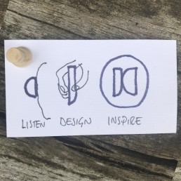
In discussions with Orbit Folkestone the key emphasis on the logo design was its need to be a strong, identifiable and distilled graphic of our new architectural approach. In conjunction with this we also developed a new practice mission statement and a three word strapline ‘Listen…Design…Inspire’ to help define and strengthen the new brand. As with all good design, the three elements helped define each other and ultimately provided a wonderfully layered meaning to the final logo and rebranding of James Carney Architects Ltd.
Ensure the Launch Stays in the Memory.
The launch was also carefully considered to ensure that all of our new and existing clients and contacts were made aware of our rebranding but in a way that hopefully stayed in the memory. So to accompany the requisite email campaign this was complemented by a more tactile and personal old fashioned postcard delivered by post.
The finishing touch was a set of beautifully designed business cards by Moo, made from recycled t-shirts, further enhancing the new practices approach towards sustainability and our environment.
All Architecture Great and Small | The Soleful Practitioner